
Charting The Performance of Stocks on a Google Sheet
When looking for stock investments, I often want to know how one stock has performed in comparison to another. Sometimes that comparison will be to an index, like the Dow Jones Industrials (.DJIA) or sometimes to a competitor company or sometimes just two staple companies in two different industries to see how the industry performance compares.
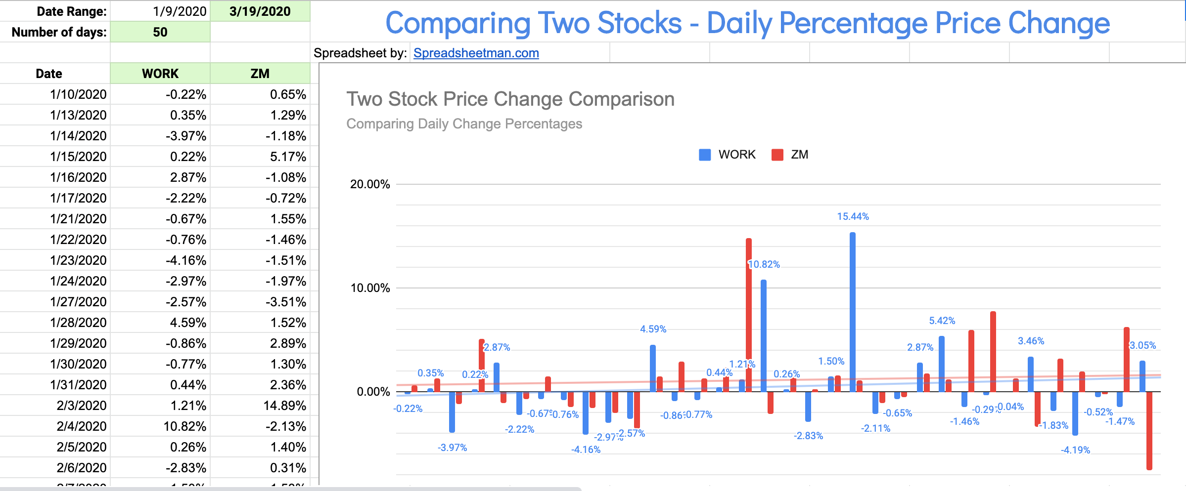
Example of a comparison: Slack (WORK) vs Zoom (ZM)
The main data you need to do this is historical price quotes - usually closing prices being enough to do the job. Google Sheets allows you to get historical data in a spreadsheet as I described in an earlier blog post. It also allows you to chart that data quite easily.
In these crazy times of COVID19 - and related crazy investment markets, I found myself wanting to do these comparisons more and more - and I also found lots of other people who wanted the same…. so, of course - I created a spreadsheet to share that does this quite easily.

The spreadsheet needs only 4 inputs - The two tickers of the stocks you want to compare, the END date of the comparison, and the number of days you want in history (up to 50). The start date is calculated backwards for you skipping weekends.
You can request access to this spreadsheet to get your own copy and do your own comparisons!